Dexter Redesign

The first time I heard about crypto, I discovered a passion. A few months ago, I was looking for a crypto project where I could contribute with UX/UI design and start developing ideas in the crypto space.

I learned about Radix network and their amazing technology. While browsing projects, I found DeXter, a community-driven DEX (Decentralized Exchange) on Radix Network. It was perfect to start my career in web3.

The Radix network

Realeased on 2013, reshaped on 2021 and on 2023 the smart contract feature was released.

Radix is unique because unlike Ethereum’s account-based system where tokens live within complex smart contracts, Radix takes an asset-oriented approach. This means easier development, potentially stronger security and a more user-friendly environment.

The DeXter DApp

Launched the MVP in January 2024, as a front-end application of AlphaDex, a central order book and matching engine.

DeXter is community-driven and anyone can contribute. Register yourself as a contributor, find a way to contribute, show other contributors your work, and get rewarded with DeXter tokens.

The DeXter DApp

Dexter is a new exchange, on a new network, has low liquidity, few users and a rough initial layout, that can be challenging to users.

Goal

  • Improve the visual design
  • Make it easier to trade on platform
  • Set design standards
  • Direct contributions

    Anyone on the community participated on the process, giving insights and feedbacks. But as a designer, I translated everything into layouts, wireframes, prototypes, and visual design.

    Analysis

    First i got on DeXter, I analyzed the trading page. Wrote down overall strong and weak points about usability and design:

    • Dexter is a new exchange, on a new network

    • Low liquidity

    • Few users

    • A rough initial layout, that can be challenging to users.

    • Layout inconsistencies

    • Many different greens, reds and grays at same page

    • Lack of response in some actions

    • Useless buttons

    • Confusing copies

    • When i’m being rewarded

    • How to add liquidity?

    Then I created a survey with Dexter users to learn about their profiles and perceptions about the platform. I asked some personal questions such as age, country of residence, profession, and familiarity with crypto to understand the user profile. I also inquired about the Dexter platform, including the best and worst aspects and potential improvements.

    • 35-year-old man

    • Very familiar with crypto technology,

    • Uses centralized exchanges like Binance and KuCoin to buy or sell

    • Trades or provides liquidity on Dexes like Uniswap.

    • Limit orders

    • Ease of use

    • Speed

    • Decentralization

    • Full custody

    • Rewards.

    • Layout inconsistencies

    • Many different greens, reds and grays at same page

    • Lack of response in some actions

    • Useless buttons

    • Confusing copies

    • When i’m being rewarded

    • How to add liquidity?

    In addition, users suggested things to add on Dexter: better charts, leverage, other types of orders, staking, a market page (listing tokens), and a landing page.

    Insight clustering

    Talking to developers and the community, we discussed the major issues, what could be fixed first, considering the impact on user experience and implementation. Each area definitely needed an update, but we needed to prioritize some of them.

    Review

    To organize our efforts, we decided to review each area of the app individualy.

    1. The first area was the orders panel because it’s the main area and many people said it was not intuitive.
    2. Order book panel,
    3. History panel
    4. Chart. The chart wasn’t mentioned by users, but I saw room for improvement.

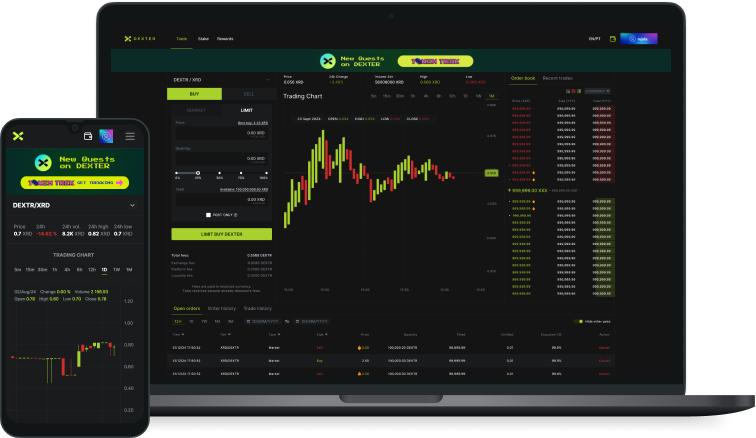
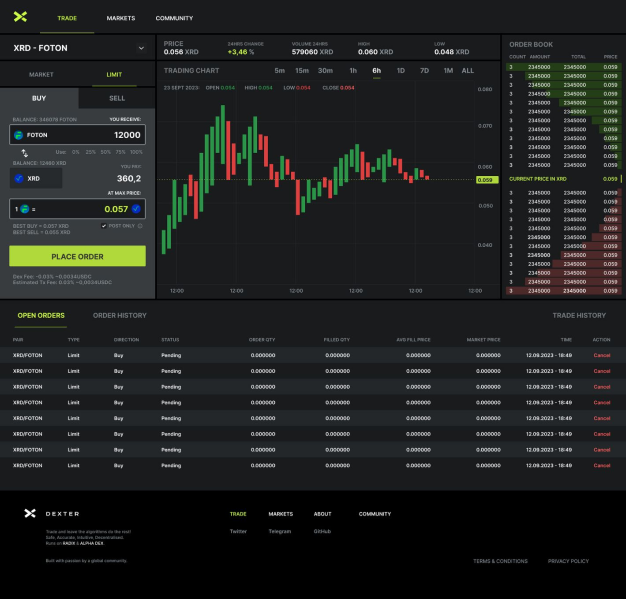
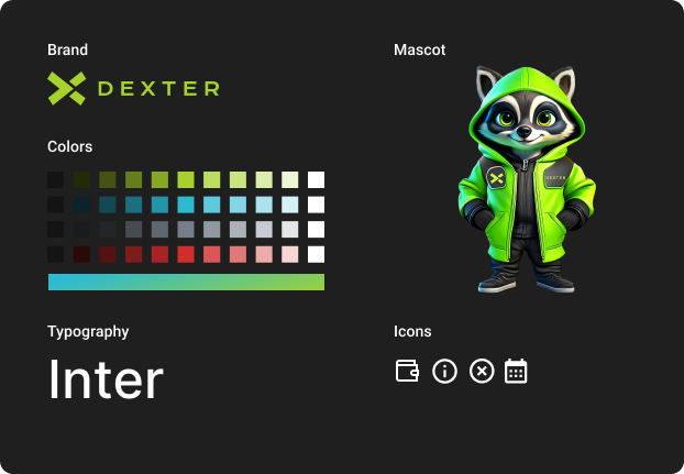
    In this first sprint, I analysed the design and got feedbacks of the community on the Dexter Telegram group.

    Struggles:

    • Messy layout
    • Confusing elements
    • Information not clear
    • Useless elements
    • Bad color contrast
    • Poor Information Hierarchy

    After more than 15 iterations testing with the community, the final result was a much more simple and intuitive design.

    This panel is very important as well. It’s used to see what’s happening to the orderbook.

    Struggles:

    • Overwhelmed layout
    • Grouping is confusing
    • Unused information
    • The user can’t spot easily where his open orders are placed
    • Dexter rewards users who open orders close to the mid-price in the current reward cycle, but is hard to spot which order is able to be rewarded
    • Is important to see the recent trades in order to track what’s happening in real time on the order book and there’s no way to see now.

    This section is useful to track the user’s trade history and open orders.

    Strugles:

    • No filters
    • Can’t spot the open orders that are able to be rewarded
    • Hard to differ from a buy or sell order

    Overall design improvement

    Each panel required many iterations and tests with community:

    I noticed a lack of direct communication with users on our platform, despite having a Telegram group and Twitter presence. To address this, I proposed implementing a carousel banner for direct communication. This banner would enable us to engage directly with users and also demonstrate that the project is active and continuously updated.


    Banners produced by community:

    Result

    Design System

    The initial version of Dexter’s UI was created in Figma, but we didn’t have an established design system. A design system is essential for streamlining the design process and ensuring it is accessible to everyone involved. It sets clear standards for elements like colors, typography, and spacing, resulting in a more consistent design.

    To address this, I took the initiative to create a design system. I extracted the typography and colors from the existing layout and expanded the palette with additional tones.

    At the moment, it’s a basic design system, but we plan to expand and improve it further as needed.

    You can check the complete design system on Figma: https://bit.ly/dexterds

    Refinement and next steps

    The project is still under development, and not everything has been implemented yet due to the need for more available developers. It’s an open project, so we build and test features with the community. When a developer becomes available, we implement the feature, test it again, and iterate as needed.

    The community is growing daily, and more features are being developed. As the only active designer, I am involved in all aspects, including the home page, rewards tool, staking tool, KPI page, and voting app.

    This summary highlights the main achievements of the past few months, with much more in development. You can see the project live at dexteronradix.com, join our Telegram group, and check the Figma file to see all the work done. Feel free to add your comments and join our community.

    plugins premium WordPress